Wednesday 18 July 2012

THE SPANISH SAHARA: 1990

Considering the fact that I am doing a styling intern at a spanish fashion brand in Spain, I took a few hours out to research into past and present editorial campaigns that represent the Spanish style and era´s in some way; not necassarily shot in Spain or styled by a Spanish stylist (ESTILISTA) yet an image that creates a Spanish ambience and mood in some way or form.

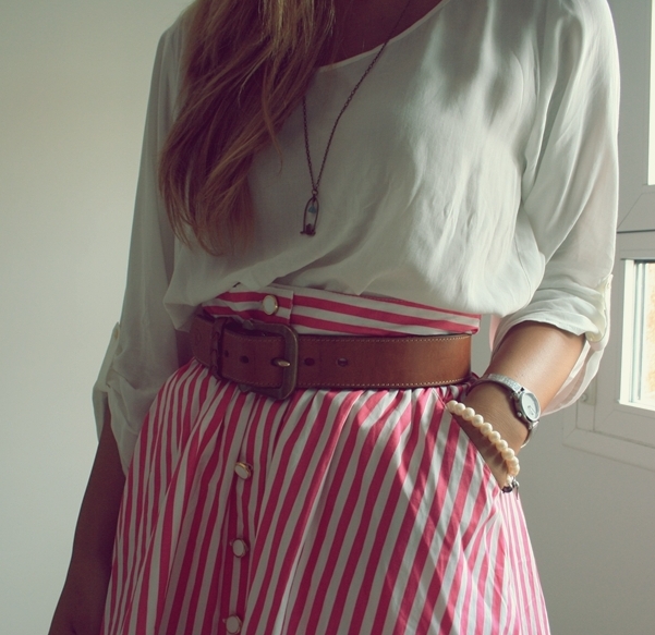
Here´s what I found...


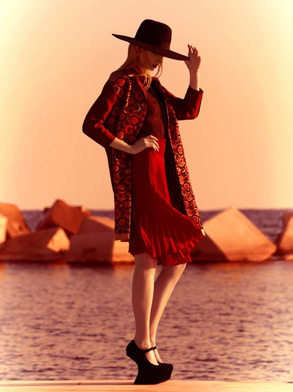
I found the article on trend hunter labelled 90´s Spanish fashion which could be the reason the images look so retro in some aspects. Colour is a huge part of these images and is what stands out the most upon first glance, colour and contrast. Can definately also see reference points coming from Spanish Flamenco dancers, especially in the last image. Besides the sharp tailoring and dramatic contrast I think my most favourite is the yellow printed crop and pencil skirt ensemble, the models silhouette against the blurred out location truly represents my time so far in Spain; strong memories and blurry long days.

Tuesday 17 July 2012

comeforbreakfast

Only just noticed this new label by Antonio Romano and Francesco Alagna. However on my daily trail of blogs, style sites and brand online spaces one of which is always Trendland.com I couldn´t help but feel intrigued by the contrast and design of their garments, which is enhanced by dramatic photography.
The name for the label may come as a surprise too, the word ´breakfast´can signify early morning, sunrise, and light eating however the design and styling of this label represents anything other than those adjectives.

All the more I love how they have layered different textures and melancholy tones to create a severe mood of darkness and mystery. The washed out tones of colour in the models hair is an interesting match too, however I would scrap the pea green background and he drones out the ambience. As for the mens styling again I love the contrast of the airy pattern of his tee against the block of darkness in his jacket. Look forward to seeing more of this label.


Tuesday 19 June 2012

ESTILISTA.

In the run up to the move to spend summer in Spain I thought it would be useful to get to know Spanish style, and how the Spanish stylista's are wearing the brand Adolfo Dominguez.
Lookbook.nu and Trendtation.com are brimming with creative images of style shots, some amateur some by stylists themselves. 

Here are the ones that caught my eye...


Leather Skirt- Adolfo Dominguez

                                                                 Belt: Adolfo Dominguez
                                                                      Jacket: Adolfo Dominguez

always idolized this girls style. Madame Rosa.


Friday 15 June 2012

SPENDATURES: PART TWO

AZTEC, EMBROIDERY, GEIGER AND CLASHING PRINTS.

Another set of images of my little spends. Seems like a lot, but it is at least two months worth. Had a cheeky trip to Liverpool with the girls and couldn't help myself when I went into Urban Outfitters, it really is such a tempting shop, I want everything in my wardrobe!


JUNE: SPENDATURES

NEON, SILVER, DENIM & STUDS.

SO..I'm going to be spending the whole summer in Spain working as a Stylist's assistant. Therefore this post has been long overdue as I have spent the last few weeks frantically buying, spending, and splashing the money so I can look the part whilst i'm over in the sunny city!


        I have a Primark denim shirt that had lace all over it, (awful!) so I ripped off the lace, cut off the sleeves
                  added some studs (Ice Nine, Nottingham) and there I have it, denim collared TEE.

                                                            YELLOW NEON TEE: Zara
                                  SILVERS: Mixed Vintage & High Street: New Look & Urban Outfitters

BRIGHTENS

Haven't written a post in a while so thought my next post needed to make a statement; COLOUR.
The backdrop in this photo shoot could be every photographers worst nightmare or every photographers DREAM. In my opinion, the location is amazing and I found myself imagining what I would do if I had the chance to shoot there.

Print and color clashing is everywhere this summer, can't say I have managed to rock the floral on floral or the zebra print with leopard print, yet these images are the definition of CLASH. And I love them.

I wish I had found them earlier before handing in the work for my final year project, as they are pretty similar to my experiments with mixed media and photography.


PHOTOGRAPHER: Nicole L Hill
STYLIST: Chesley Tolentino
MODEL: Jennifer McManis


Examples of the shoot I created for final project. I edited it by scanning in watercolors from my sketchbook and enlarging them on Photoshop, multiplying them in with the photograph. The styling is mixed media too, using an eclectic pattern cut out for the top and structure shorts. 

PHOTOGRAPHY: Kay Pearson & Hannah Dodds
STYLING: Kay Pearson
EDITING: Kay Pearson
MODEL: Lauren Scott


Saturday 12 May 2012

Really inspired by these mixed media digital collages by Sinead Leonard. Not only are they splendid and stunning to the visual eye but they also portray a sense of power in the female form.

I may have to try and create something similar for my final project.